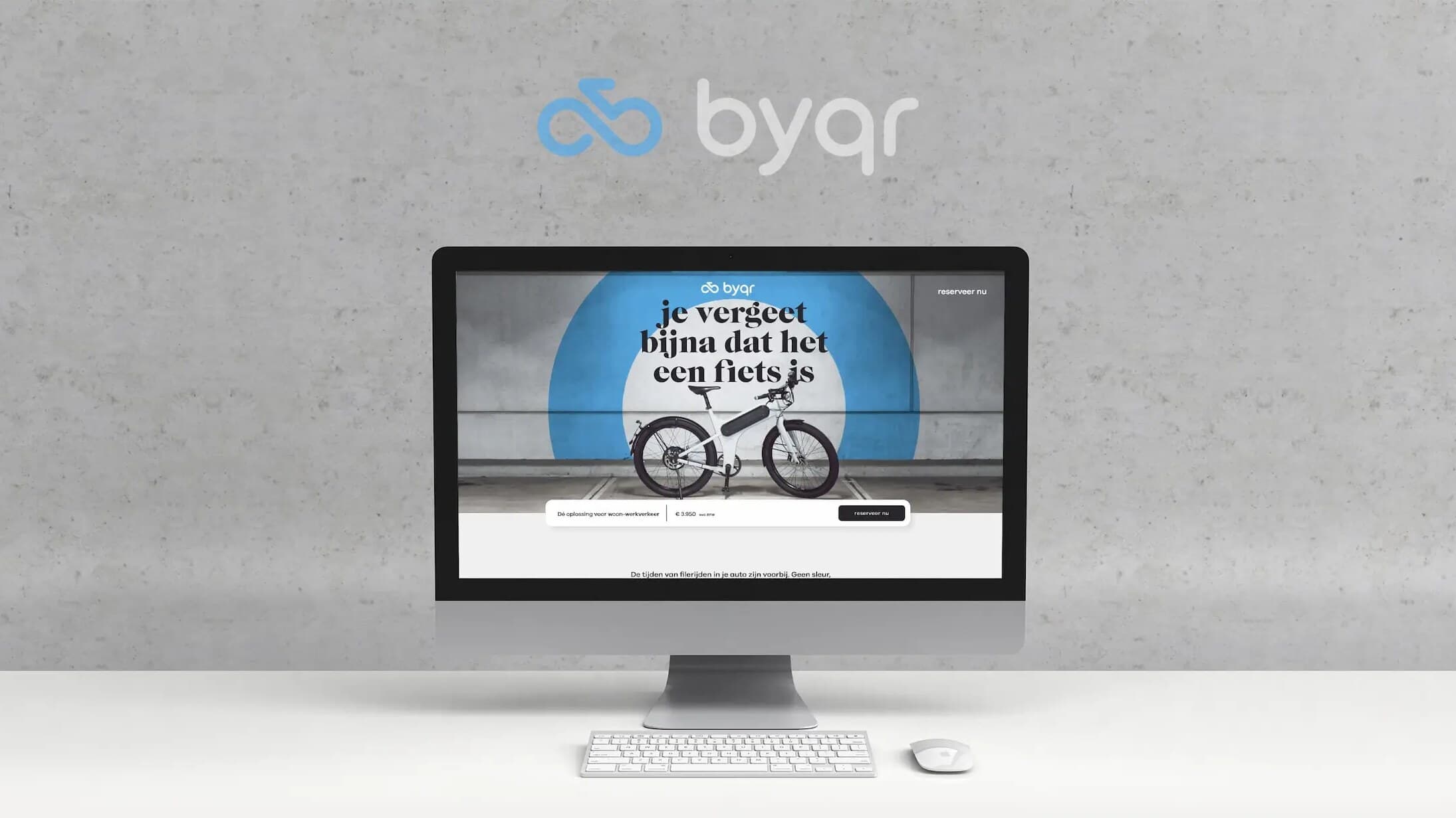
Byqr
Hand-built launch website for Byqr, the first Dutch speed pedelec brand.
01
The Brief
Byqr was the first speed pedelec brand from the Netherlands, pitched as a serious alternative to the car for commutes of 10 to 35 kilometers. The agency Scheepens created the brand and designed the website, and the founders asked me, as a freelancer, to build it for the launch in March 2021. The design only covered desktop, but the site had to work just as well on a phone.
02
My Approach
I worked directly with Scheepens and the founders. First I designed the mobile and tablet versions myself, working out how each section should stack while keeping Scheepens' look intact. Then I built the one-pager by hand in HTML, CSS and JavaScript instead of a WordPress theme, so the design didn't have to bend to a template and the page stayed light.
In August, Byqr came back to turn the page into a place to collect leads. Forms for reserving a bike and booking a test ride slide in from the side, and a newsletter badge unfolds into a signup form as you scroll. Every form feeds one Mailchimp list, tagged by where the contact came from.
03
The Result
The finished site is hand-built and responsive, and walks through the bike's selling points, from a real 45 km/h to a belt drive that needs no maintenance.
04
Outcome
The site had 858 unique visitors in its first week, and the client loved that it was built to measure. It confirmed that I prefer building sites myself, because it gives me full freedom over the design and lets me bring more of my own skills into the work.
Stills
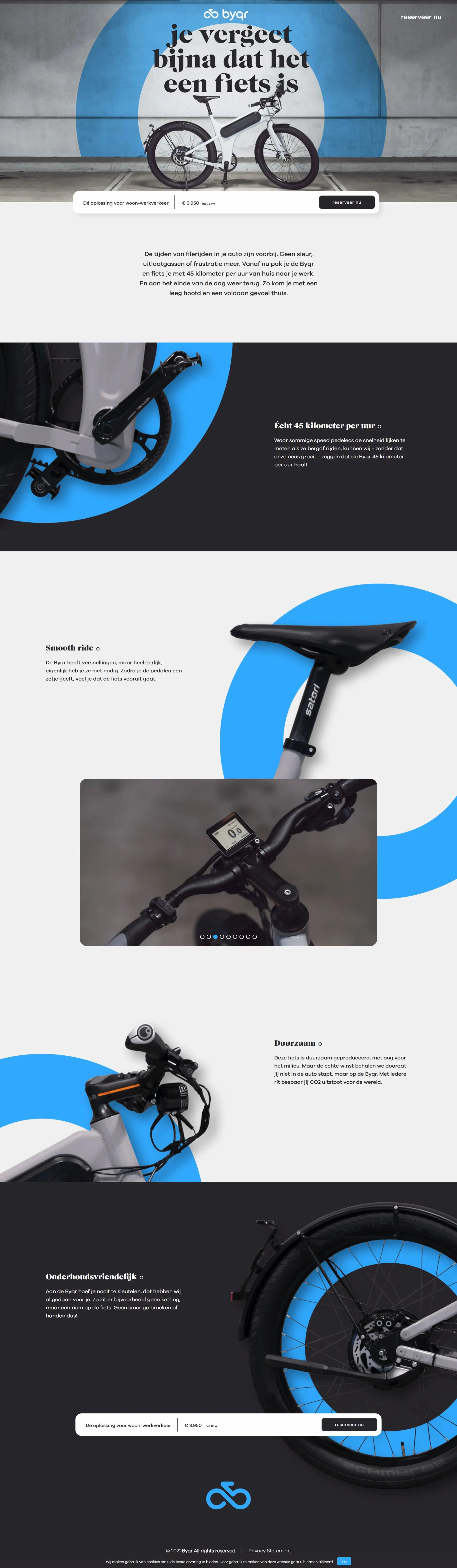
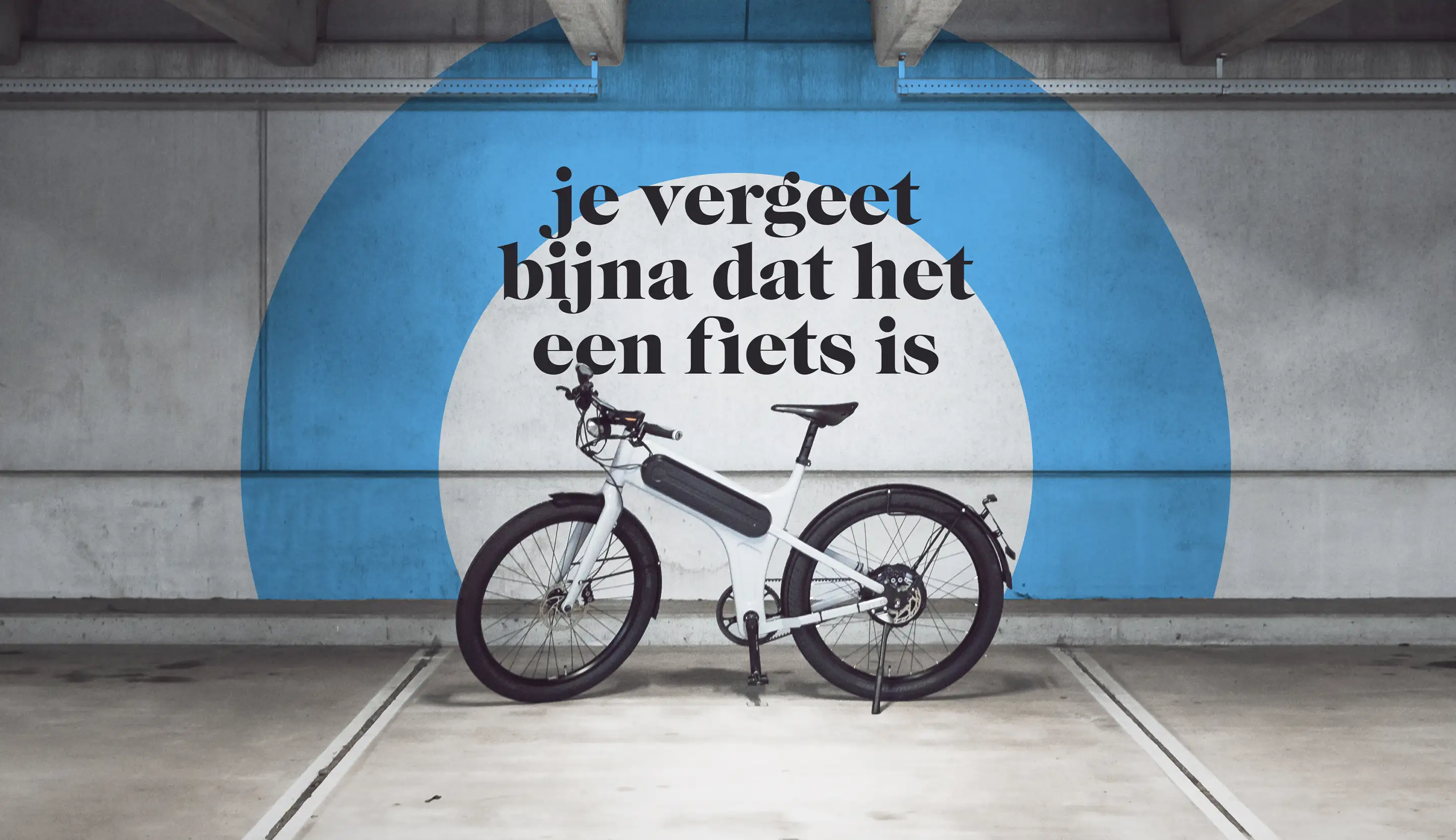
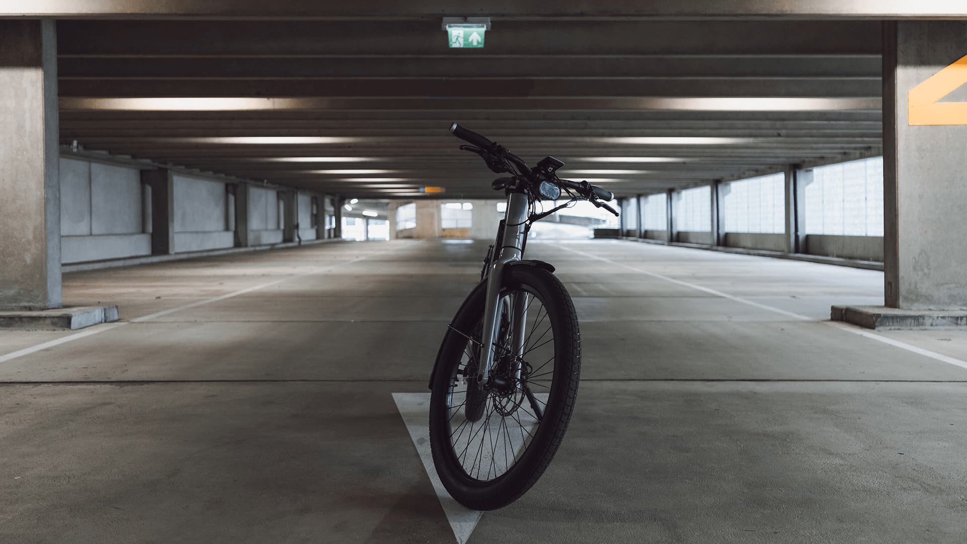
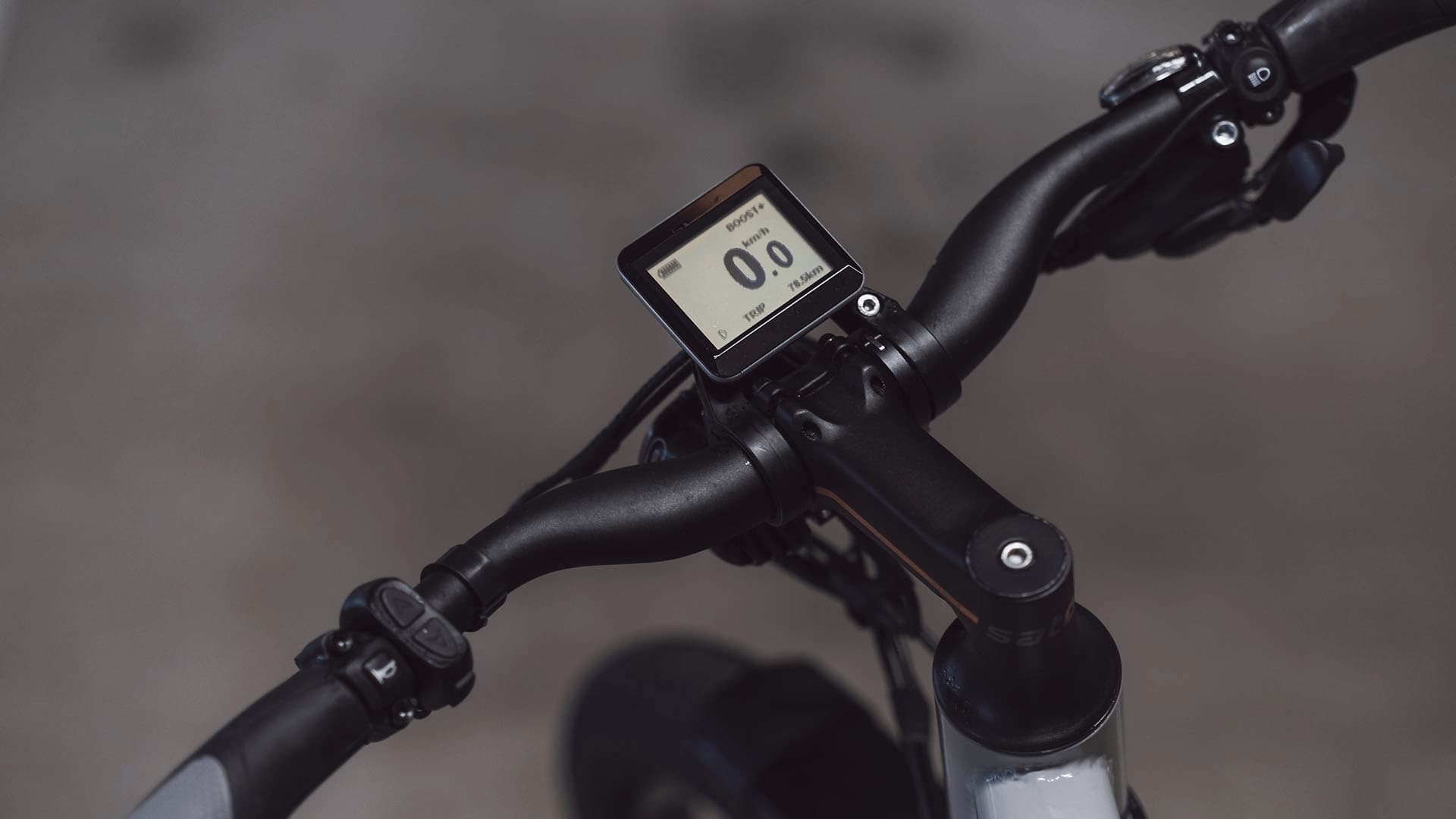
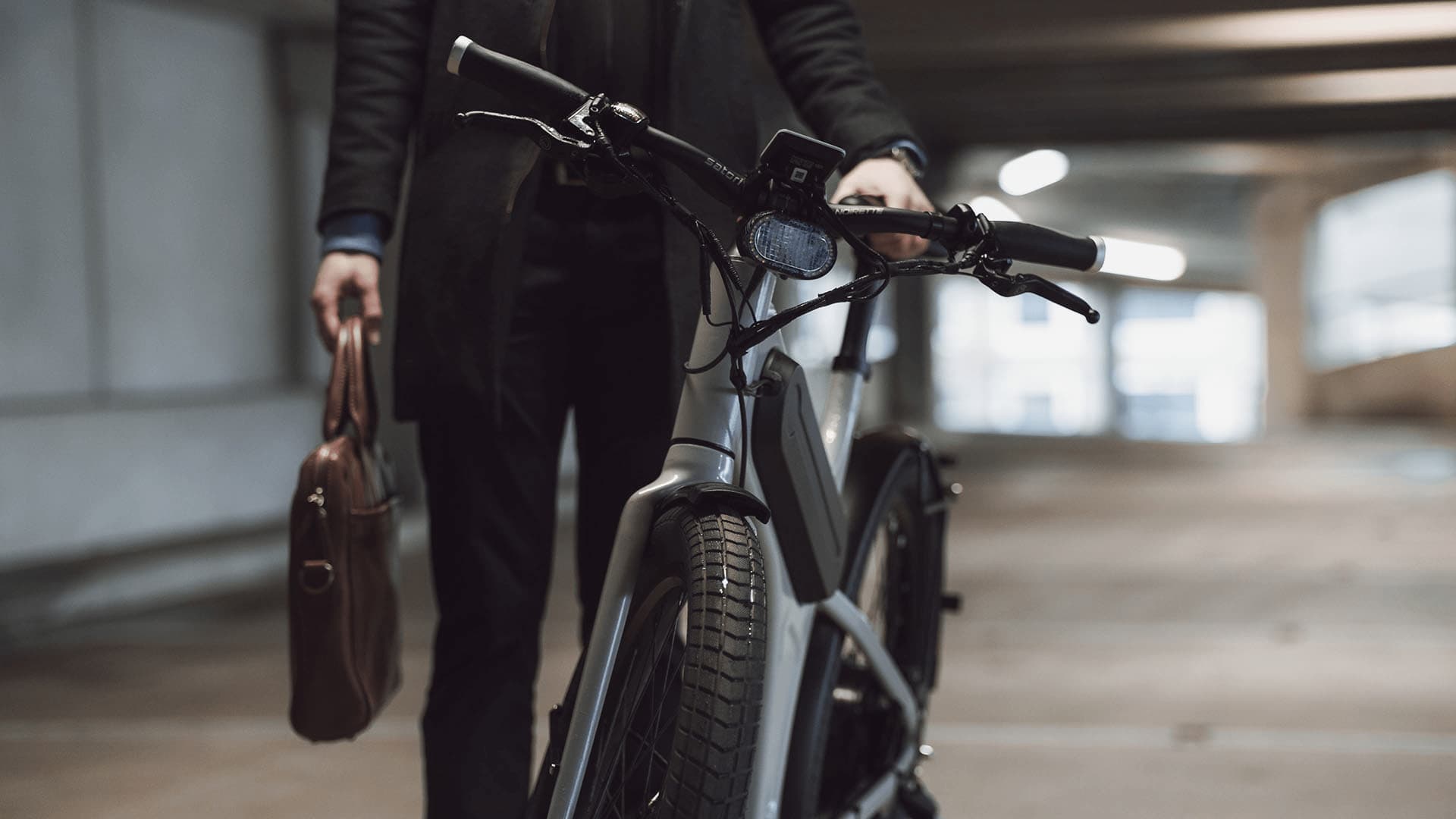
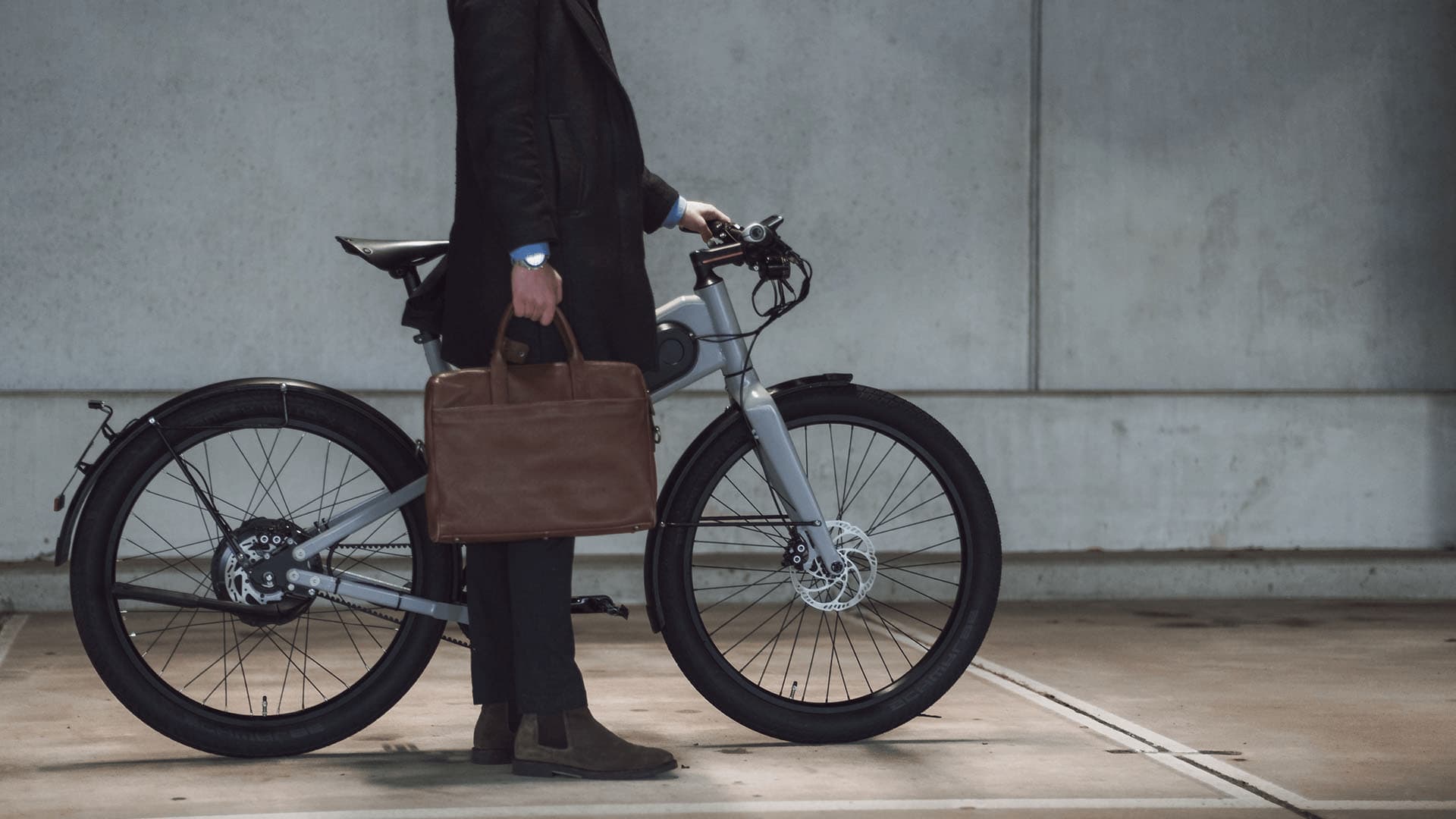
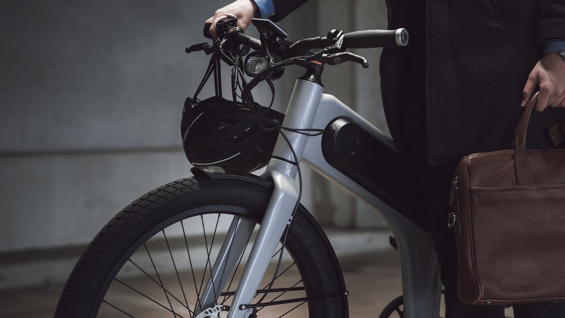
The full desktop one-pager, from the key visual down through the feature sections.
03 / About
Concept first, medium second
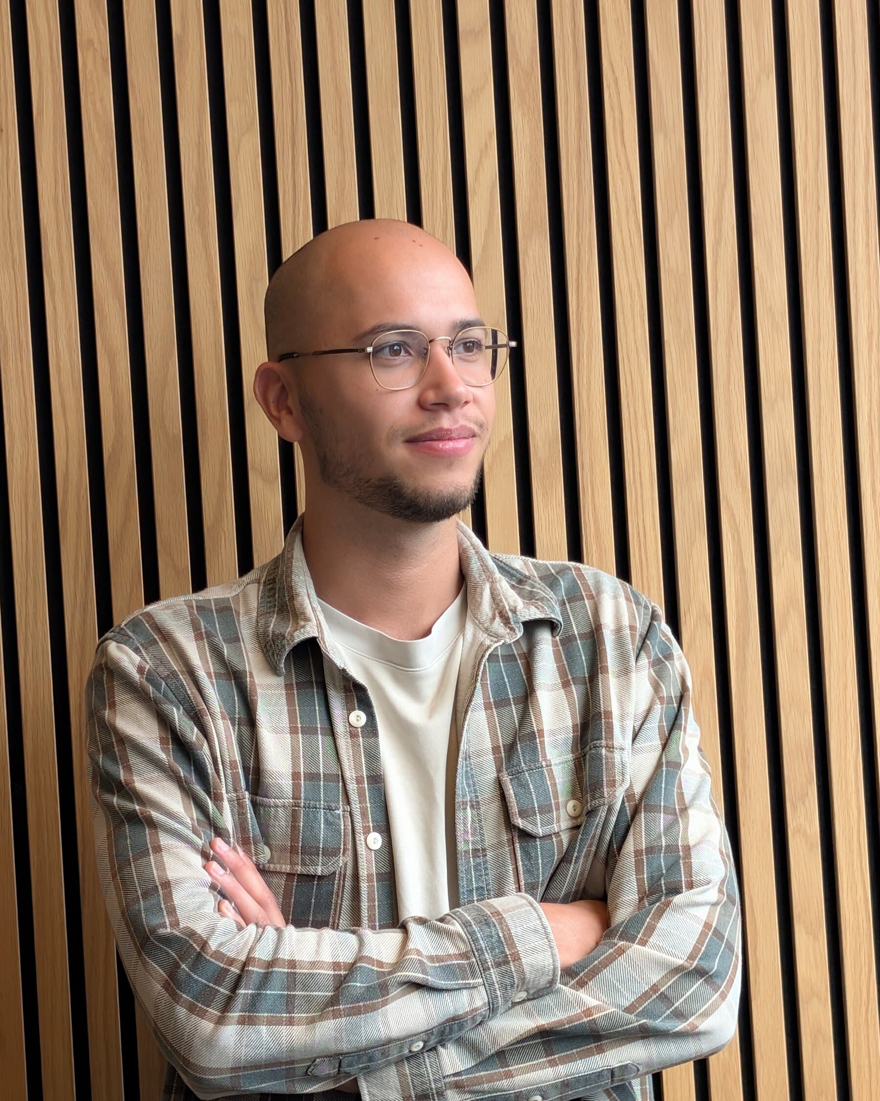
I'm Ramon, a multimedia designer based in Eindhoven. Projects start with a problem: what the thing has to do, and how someone should move through it. The answer has been a 360 film, a VR walkthrough, an explainer animation, a configurator and an AI training platform.
My part is 3D, design and code: modelling and lighting in Blender, interface and motion in XD/Illustrator and After Effects, plus the build in PlayCanvas or Next.js.